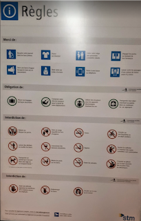
Subway Rules
The Montreal Metro I believe uses the typeface FF Transit. This is a sans serif font with a centre stress.This sign was found in the Lionel-Groulx subway station. It details the general rules of the subway, and its audience is french-speaking subway passengers.This poster demonstrates hierarchy of text being used in order to convey a message and be informative. The heading is in the top left corner in the largest font. This allows for the reader to understand what the poster communicates at first glance. The subheadings are smaller and highlighted in grey. They are used to break up and organize the information. Finally, the body text is used to detail the exact rules, and is in the smallest font. A lack of hierarchy is also conveyed in this poster. All the rules are set the same way with the same font and size. conveys that all the rules are equally as important, even if they are not. The suggested rules are at the top of the poster and the most important rules are at the bottom.
