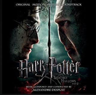
Harry potter poster
"Harry potter and the Deathly Hallows" poster
This poster from the Harry Potter and the Deathly Hallows movie part 2 was made for the final movie of the franchise. When I saw this poster I automatically recognized the serif fonts used all around the poster. Even the famous type used for "Harry Potter" is a serif font.
This poster reminded me of structure and inflection because of the way the entire composition is centred around the central axis. This axis, clearly determined by the wand, is also followed by the long decending "lightning bolt" of the P in Potter, to accentuate the symmetry in the poster. The entire movie is centred between the conflict of these two characters and the poster does the same thing. The wand seperates both figures who are facing each other and all of the type used is centered with the axis of the wand. (Except for the "and the Deathly Hallows part 2" going in diagonal breaking this structure and symmetry)
What I learned from looking at this example of structure a way to possibly organize my work, by centering most elements to accentuate a certain effect or conflict.
#structure #jadzoubair
